

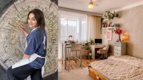
Perfect homes are slowly going out of fashion. The overly polished living room with untouched cushions, glossy surfaces, and art picked only to match the curtains is making way for something far more personal. Homes in 2026 are starting to feel softer, moodier, and far more tactile. Artists are influencing interiors in a big way right now, bringing attention back to texture, material, and emotional connection instead of showroom perfection.

Mumbai-based contemporary artist Pooja Bhansali, whose work blends textiles, wood, resin, and abstraction, believes people are craving spaces that feel lived in rather than overly styled. “People are tired of interiors that look beautiful in photographs but feel cold to actually live in,” says Bhansali. “There’s a real hunger now for spaces that have memory, surfaces you want to reach out and touch, pieces that change depending on the light or the time of day.”
What are tactile interiors?
Tactile interiors focus on how a home feels, not just how it looks. The idea is to create spaces with warmth, texture, depth, and materials that feel natural and layered instead of overly polished.
Here’s what defines the look in 2026:
• Natural fabrics like linen, wool, raw silk, and jute are replacing synthetic heavy finishes
• Mixed materials such as wood, resin, fabric, and matte metals are used together for depth
• Textured art and decor that feel handmade instead of factory finished
• Warm earthy tones like terracotta, ochre, dusty mauve, and deep browns replacing cool greys
• Negative space and restraint are becoming just as important as styling itself
Want to introduce art pieces to your home? Start with texture, not size
One of the biggest mistakes people make while buying art is assuming bigger automatically means better. Bhansali believes the emotional effect of a piece comes less from scale and more from material depth.
“A small piece with real material depth, something in resin, in fabric, in layered mixed media, will do more for a space than a large but flat canvas,” she says.
This idea becomes especially useful in compact urban homes where oversized art can easily dominate a room. Instead of filling walls simply because they are empty, she recommends looking for works that create curiosity through texture and layering. Fabric embedded into artwork, visible wood grain, matte surfaces, and uneven finishes instantly make a room feel warmer and less staged.
This shift is a clear indicator of how we are changing our approach to our homes and how they feel. Nobody wants to live in that space that needs to be covered up and protected. We are all looking for that comfort that comes from a space being truly used, felt, lived in, and it is getting tailored to the minimalist and maximalist preferences of the occupants, not what the internet is screaming about!
The materials set to shape homes in 2026
The next phase of interiors is moving away from glossy perfection and leaning into materials that feel warmer, softer, and more tactile. Instead of surfaces that look factory finished, homeowners are leaning toward pieces that carry texture, grain, layering, and visible craftsmanship.
“I think we’re moving away from the ultra glossy, overly finished aesthetic and toward things that feel found, honest, and handmade,” says Bhansali.
Linen and raw fabrics
Natural fabrics like linen, jute, wool, and raw silk are becoming central to interiors because they instantly soften a room. These materials add depth without making a space feel visually heavy. They also work beautifully across upholstery, artwork, cushions, and even wall panels, giving homes a more relaxed and lived-in feeling.
Warm woods and teak
Wood is returning in a much richer way in 2026, especially teak and darker, warm-toned finishes. Instead of polished surfaces, people are leaning toward visible grain and imperfect textures. Bhansali also points out that wood is now being used more creatively within art and sculptural decor pieces instead of only furniture.
Matte black finishes
Matte black is slowly replacing chrome and ultra reflective finishes in modern homes. The reason is simple. It grounds a space quietly without pulling attention away from everything around it. Used through lighting, hardware, frames, or smaller decor details, matte black adds contrast while still feeling understated.
Resin and layered surfaces
Layered materials are becoming increasingly important in artistic interiors. Resin poured over fabric, mixed media artwork, textured ceramics, and hand-finished surfaces all create subtle variation within a room. These details make spaces feel more personal because no two surfaces look completely identical.
Gold accents are used sparingly
Gold is making a return, too, but in a softer and more restrained way. Instead of ornate metallic finishes, small touches of gold leaf or brushed gold add warmth and depth without making a room feel overly formal. It works best as an accent rather than the focal point.
Together, these materials create interiors that feel calmer, emotionally layered, and far more inviting to live in. The focus is no longer on making homes look perfect. It is about making them feel personal.
Why perfectly matched homes often feel flat
The early 2000s saw a phase when homeowners wanted everything to coordinate precisely. Matching cushions, matching artwork, matching tones across every surface. Bhansali believes that approach can sometimes strip a room of personality. The boom caused design to become a series of rendered images on a computer screen, all looking the same.
“Art that perfectly matches its surroundings risks becoming wallpaper,” she says. “The best pieces I’ve ever seen in homes are the ones that create a slight tension, a moment where the room holds its breath.”
One of Bhansali’s strongest design beliefs has nothing to do with buying more. It is about resisting the urge to fill every corner.
For contemporary Indian homes, especially in visually noisy cities, she believes restraint has become one of the most important styling tools. “Not every corner needs to be styled,” she says. “Let one wall breathe, let one surface remain bare.”
Her ideal 2026 palette also reflects this softer direction. Warm neutrals paired with earthy tones like deep ochre, dusty mauve, or muted terracotta create spaces that feel grounded without becoming heavy.
Homes are starting to feel like homes again. A little bit of you in every corner, and also a lot of hand-me-downs, thrifted pieces, art you love, unique furniture finds and more. We have two choices at the crossroads here, and going down the tactile road might just save us all from losing the true meaning of living at home.
Similar articles for you
Cushion covers to brighten up your rooms this summer; My top 8 picks
Office chairs with lumbar support: Understanding why this is important for your back
Switched my armchair to an ergonomic office chair: Changed how I work from home
The author of this article holds a Master’s Degree in Interior Design and has spent over a decade in research, teaching, and designing homes from scratch.
Disclaimer: At Hindustan Times, we help you stay up-to-date with the latest trends and products. Hindustan Times has an affiliate partnership, so we may get a part of the revenue when you make a purchase. We shall not be liable for any claim under applicable laws, including but not limited to the Consumer Protection Act, 2019, concerning the products. The products listed in this article are in no particular order of priority.
